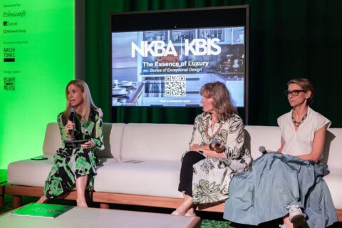


This panel brought together leading interior designers with experts from Signature Hardware and Sherwin-Williams to explore color and materiality to create spaces that feel layered, timeless, and deeply personal
Panelists: Ashley Gilbreath, Ashley Gilbreath Interior Design; Anita Yokota, Anita Yokota Design; Johnathan Sanders, Signature Hardware; Sue Wadden, Sherwin-Williams
Moderator: Mel Studach, ADPro
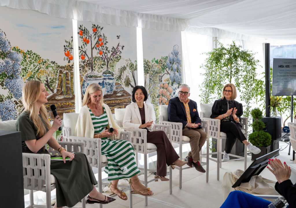
“When we first walk into a space, our nervous system scans the room for safety,” said Anita Yakota inside the terrace at Broad Hall. “What we see is really what we’re feeling at first.”
Aside from being an interior designer, Anita is also a licensed therapist, which brought a unique perspective to this panel gathered at the terrace in Broad Hall—with artist Manuel Santelices’ ethereal watercolor illustrations hanging in the backdrop.
Ashley Gilbreath agreed. “When you can walk in the home and have that automatic sense you’re being welcome—that’s always what you want.”
How do these designers approach those early discussions with clients? True to her interest in psychology, Anita starts with getting to know her clients—their relationships, core desires, their “why”. Then the intentionally of color and materials start falling into place,” she said.
“Editing has been my word for the last two to three years,” said Ashley. “We ask clients for no more than three to five images to pinpoint what they really like.” Having a client get really clear on their preferences narrows the scope and raises the standards immediately.
Experimenting and pushing boundaries
On the other hand, designers are there to help clients take risks. One of the easiest ways to do that is with paint color. “As obvious as it sounds, we can repaint,” noted Ashley. “It’s not crazy committal. It’s experimental.”
Hardware is another excellent venue for taking chances. Think of it like jewelry. “You can be crazy bold with something you do in a sink or vanity,” said Johnathan Sanders.
“When everything matches perfectly, it looks kind of stuffy,” added Ashley. “As designers we try very hard to make things look like you’re not trying very hard”.
Anita points to nature as our best teacher. “Nature is a great example to show clients that even though things aren’t matching, they belong together.”
Keeping an eye on evolving trends
Sue Wadden noted that stain cabinets are coming back for kitchens in a big way—a stark contrast to the white and grey tones that prevailed only five years ago. “The 90s are starting to creep back in,” she said.
Acknowledging the popularity of bringing the spa experience into the bath, Sue suggested “Making rooms your kids hate a sanctuary—like laundry rooms. That’s an awesome place to bring intention, including color.”