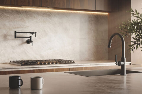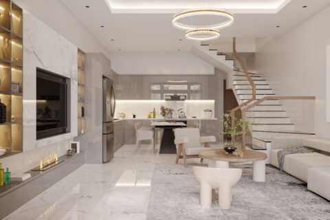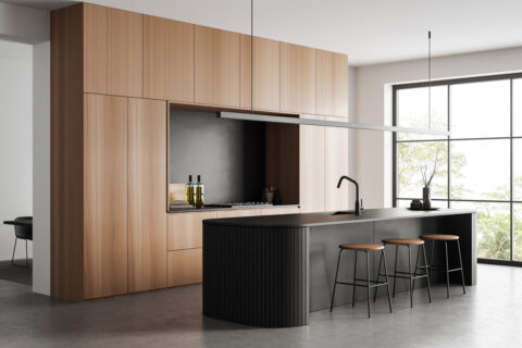









Bold color is one of the key headlines of NKBA’s 2027 Kitchen Trends Report. Our panel outlined a playbook for specifying colors in the kitchen.
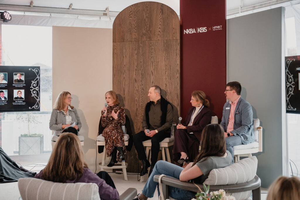
Sarah Robertson, Studio Dearborn
Richard Anuszkiewicz, Raith Design Studio
Sue Wadden, The Sherwin-Williams Company
Moderator: Jill Waage, Editor in Chief, Traditional Home
While it may seem like neutral kitchens are remnants of a bygone era, this panel revealed that clients are still hesitant to play with color. But there is hope.
“There are thoughtful ways to introduce color and overcome those fears,” said Richard Anuszkiewicz. “Neutrals aren’t going to go anywhere. But we can be selective and thoughtful in order to introduce personality and soul.”
How exactly should designers pursue those conversations?
Sarah Robertson starts with the layout and function. “It’s an opportunity to build trust. Once you’ve spent time discussing how they will live in the space, then we talk about color, finishes, and special touches. And then when we start doing the rendering, we’ll add color and get their reaction.”
“Depending on how they want to feel in the room, we can then work backwards to determine the best colors to create that feeling,” said Anuszkiewicz. “Clients don’t know what they don’t know. It’s our job to inform them and lead them. It’s our role to take their dreams and desires and expand them in ways they hadn’t thought of.”
For Sue Wadden, stains are where it’s at. “Wood tones are absolutely back again, and they’ve become the language of design. We’re seeing that sort of raw-wood finish, hickory, deep walnuts.”
Andrew Shead is adamant that the conversation about color has to be done by a designer. “That’s something we really believe in, and it’s really taking off. This year we exceeded the color match requests of previous years.”
The panelists agreed that color is far easier to introduce when there is a personal connection to the client, such as a hue inspired by a trip to Italy–or matched to the client’s vintage Porsche.
Anuszkiewicz likes to include a signature color stamp, such as painting the insides of cabinets red. “No matter what the exterior is, it provides a wow factor,” he said. “It’s a way to make a statement without overcommitting.”
Appliances, pantries, sculleries, and even the insides of cabinetry present opportunities for personalization. “It’s important to think of continuity,” added Robertson. “If we’re bringing in color to an appliance, where else can we tie it together?”