

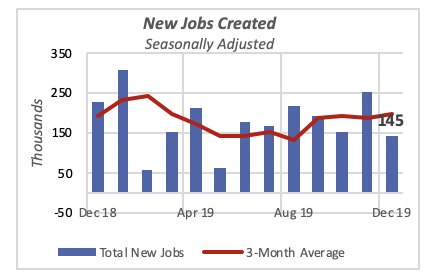
New Job Creation Softens Slightly
New jobs in December at 145,000 were lower than those of the previous month, when 256,000 jobs were created; but they were nearly equal to the number created in October. December, however, is below the number of jobs added in each of the preceding six months.
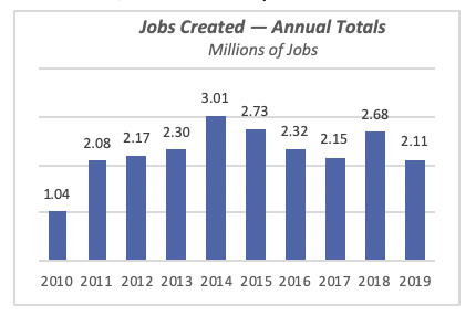
For the year, a total of 2.11 million jobs were created in 2019, also lower than the previous period. In fact, the 2019 total is 571,000 fewer new jobs than the total added in 2018, when 2.68 million jobs were added. In fact, 2019’s total is the lowest number of new jobs created since 2011, when the tally reached 2.08 million.
The largest contributor to December’s job growth was Retail Trade, which added 41,000 jobs in the month, or 28% of the total. This is followed by Health Care, adding 28,000 jobs, or nearly one-fifth of the total; and Hospitality, which added 25,000 jobs, for 17% of December’s total.
The construction industry came in fourth place, accounting for one in seven new jobs, or 20,000 jobs.
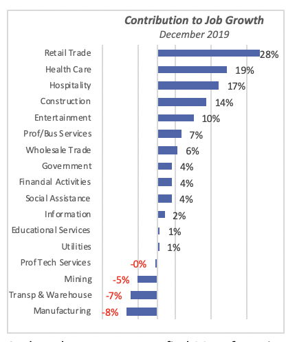
At the other extreme, we find Manufacturing with the biggest losses, at 12,000 jobs. Further, despite the travails that manufacturing sector is going through because of the U.S.-China trade situation, the Manufacturing sector added 46,000 jobs last year. But this is a big drop from the 246,000 jobs added in Manufacturing in 2018.
Unemployment Rates Fall Among All Demographic Groups
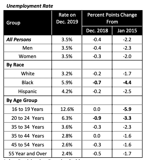
Other key employment measures also were favorable last year. The unemployment rate was 3.5% at yearend, nearly one-half of a percentage point below what it was a year before, in December 2018. Last year’s decline was the continuation of a trend that started at the end of the 2007-2009 recession; the last five years of this trend are depicted in the chart below, which shows unemployment rate data by gender as well as well as by race.
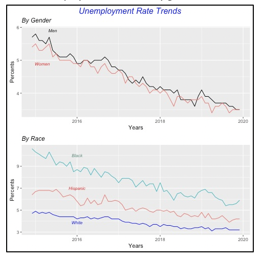
The unemployment rate fell last year for virtually all gender, race and age groups. But the biggest strides were made among Blacks, who saw their unemployment rate fall by 0.7% from December 2018, and 4.4 percentage points over the five-year period 2015-2019.
Within age groups, 20-to-24 year-olds had the biggest drop, falling by 0.9% compared to a year before, and also by 3.3 points over the last five years.
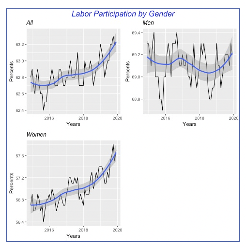
Labor Participation Remains Stable
The overall labor participation rate, however, remained unchanged at 63.2% in December, marginally better than the 63% rate of December 2018. As a reminder, the labor participation rate is the percentage of able workers who are either employed or seeking a job, that is, the percentage of the total available pool of people whom we can call “active.”
Now, we should not expect to see sharp changes in the participation rate over short periods of time, such as a year. Like many other demographic factors, changes occur gradually over time, and the rate should be analyzed over longer periods to see underlying changes. In fact, over the latest 12 months, the overall rate has fluctuated within a short band of 0.4%, ranging between 62.8% and 63.2%.
The chart below displays the total participation rate since 2015, as well as that for males and females. Overall, there is upward movement in the participation rate rising from roughly 62.7% in 2015 to the current 63.2% rate; the underlying trend is captured by the blue line. Note that the three graphs within the chart use different scales.
It is also evident that the overall trend is the result of increases in participation among females, which increased by roughly 1% over this five-year period, from 56.7% to about 57.7%. The male participation rate has not changed over the same period. At least it did not decline over this period, as was the case between 1960 and 2015, when the rate fell from nearly 84% to 69% in the latter year.
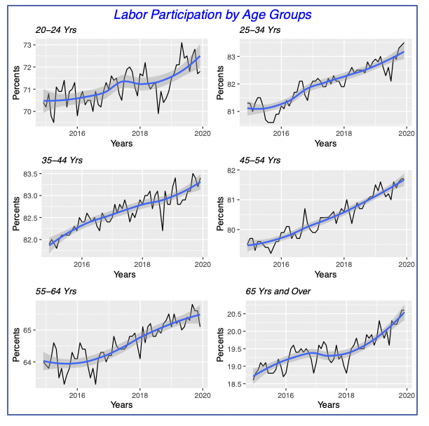
For illustration purposes, the chart below shows labor participation for six age groups. We can see that participation has improved among all groups since 2015. Again, although not shown here, the improvements in participation are driven by females among all age groups.
Manufacturer Shipments Improve
Manufacturer shipments increased 0.3% in November to $502 billion for the month, following a more modest gain of 0.1% the previous month. But, despite these gains, shipments in November were 0.8% below their prior-year level.
In fact, as can be seen in the chart below, shipments have followed a declining trend for more than a year, since they hit an all-time high of $508 billion in October 2018. Needless to say, U.S. shipments have been impacted by the still fully unresolved trade dispute with China.
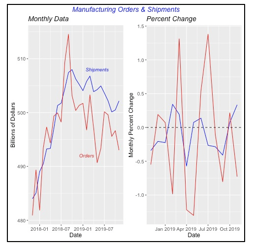
New manufacturer orders have also followed a similar path, with their latest peak in September 2018, when new orders reached $515 billion. Although this is lower than the $550 billion in orders received back in July 2014, when the total for new orders was boosted by a huge order for new aircraft that totaled $70 billion, significantly higher than the normal average or roughly $16 billion seen in the previous year.
The chart to the right above, which displays the monthly percent changes, clearly shows much greater variability in manufacturing Orders than in Shipments. One reason is that businesses place orders for manufactured goods as they think they need, regardless of the capability of manufacturers to deliver the product. But manufacturers ship goods according to their production schedule, which they try to keep on an even keel.
Interest Rates Ease Again
The 30-year, fixed mortgage rate fell by 0.08% to 3.64%.
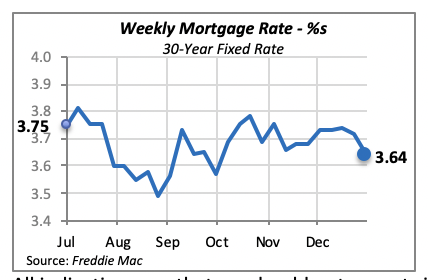
All indications are that we should not expect significant changes in mortgage rates, in either direction, since the Federal Reserve Bank appears to be willing to maintain an unchanged policy posture over the next few months.
Manuel Gutierrez, Consulting Economist to NKBA
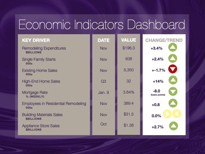
Explanation of NKBA’s Economic Indicators Dashboard
The dashboard displays the latest value of each economic indicator with a colored triangle that highlights visually the recent trend for each of the drivers. “Green” is a positive signal, indicating that the latest value is improving; “Yellow,” as it’s commonly understood, denotes caution because the variable may be changing direction; “Red” indicates that the variable in question is declining, both in its current value and in relation to the recent past.
Note that all the data, except for “mortgage rate” and “appliance-store sales” are seasonally adjusted and are represented at annual rates.
Remodeling Expenditures. This is the amount of money spent on home improvement projects during the month in question. It covers all work done for privately owned homes (excludes rentals, etc.). The data are in billions of dollars and are issued monthly by the U.S. Department of Commerce.
Single-Family Starts. This is the number of single-family houses for which construction was started in the given month. The data are in thousands of houses and are issued monthly by the U.S. Department of Commerce.
Existing-Home Sales. These data are issued monthly by the National Association of Realtors and capture the number of existing homes that were sold in the previous month.
High-End Home Sales. This series are sales of new homes priced at $500,000 and higher. The data are released quarterly by the U.S. Department of Commerce and are not seasonally adjusted. Thus, a valid comparison is made to the same quarter of prior year.
Mortgage Rate. We have chosen the rate on 30-year conventional loans that is issued by the Federal Home Loan Mortgage Corporation (known popularly as Freddie Mac.) Although there are a large number of mortgage instruments available to consumers, this one is still the most commonly used.
Employees in Residential Remodeling. This indicator denotes the number of individuals employed in construction firms that do mostly residential remodeling work.
Building-Materials Sales. These data, released monthly by the Department of Commerce, capture total sales of building materials, regardless of whether consumers or contractors purchased them. However, we should caution that the data also includes sales to projects other than residential houses.
Appliance-Store Sales. This driver captures the monthly sales of stores that sell mostly household appliances; the data are stated at an annual rate. We should not confuse this driver with total appliance sales, since they are sold by other types of stores such as home centers.
We hope you find this dashboard useful as a general guide to the state of our industry. Please contact us at Feedback@nkba.org if you would like to see further detail.


